

We’ve all seen them websites with ten flashing buttons, layouts held together by duct tape and dreams, and hero sections so busy they could trigger a software update. Bad web design has a special talent: it takes something simple and turns it into a digital migraine. From chaotic layouts to color choices that attack the corneas, these are the everyday design mistakes that make users quietly close the tab.
Quick Checklist for Web Design
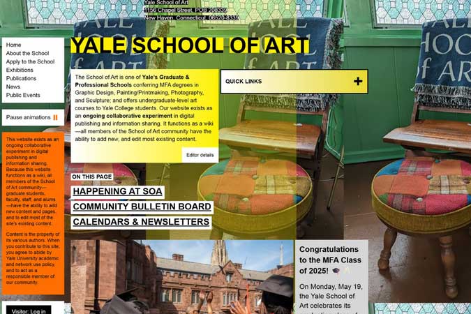
Nothing tanks a website faster than a layout with zero hierarchy. When everything is large, bold, flashing, or fighting for attention, nothing stands out not even the stuff that actually matters. It’s like being in a room where everyone is yelling directions at you.
Good design guides the eye. Headings lead to paragraphs, buttons feel purposeful, and spacing creates breathing room. Bad design throws content at the screen like digital confetti and hopes the user figures it out. When your layout becomes a puzzle, users don’t solve it they leave.
Designer Insight
If everything is important, nothing is. Use clear hierarchy: one primary action, supporting content, and consistent spacing. Let the layout guide users — not confuse them.
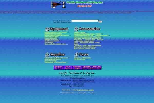
Color can make a website feel modern, trustworthy, and polished — or like it was designed inside a lava lamp. High-saturation colors, vibrating color pairs, and neon-on-neon text belong in laser tag arenas, not interface design.
Good color choices create harmony. Bad ones create optical illusions. If your CTA button looks like it’s buzzing or your text vibrates off the background, the problem isn’t the user’s screen — it’s the palette.

Poor contrast isn’t just ugly — it’s inaccessible. When your text blends into the background or becomes impossible to read on mobile, you’re not just breaking good design rules, you’re breaking usability.
The best color systems rely on contrast, balance, and intentional accent colors. And if your website looks like a highlighter collection exploded, it might be time to rethink the palette.
Designer Insight
Great color design isn’t loud — it’s clear. Follow the 60–30–10 rule: 60% base, 30% secondary, 10% accent. Your users (and their retinas) will thank you.
Animations, pop-ups, autoplay videos, bouncing buttons — chaos doesn’t convert, it overwhelms. If your site feels like a carnival of distractions, users won’t engage with the content. They’ll just try to stop the sensory overload.
Decorative elements should enhance the experience, not hijack it. When everything moves or sparkles, the site stops being functional and starts becoming a digital obstacle course.
The trick is moderation. Use animation to guide the user’s attention, showcase interactions, or provide feedback — not to prove how many CSS tricks you know.

Designer Insight
Great interaction design feels invisible. If users notice your animations more than your content, it’s time to dial it back.
Good design isn’t about being flashy — it’s about being clear. Layout, color, spacing, and motion all work together to guide the user and support the message. When one of those elements goes off the rails, the entire experience feels off-balance.
Every pixel carries purpose. Whether it’s leading the eye, reinforcing a message, or creating a mood, great design works quietly in the background. Bad design, on the other hand, screams its mistakes at you.
So don’t let visual noise, painful color choices, or layout confusion ruin your message. Keep it clean, keep it intentional, and let clarity lead the way.
Browse more Web Don’ts articles to see digital design disasters in the wild — and learn how to fix them before they break your site.
Your weekly dose of sarcasm and insight delivered straight to your inbox