We’ve all seen them, signs that shout in ten different fonts, menus that look like ransom notes, and logos that make Helvetica cry. Bad typography has a special power: it can ruin even the best design ideas in a single glance. From tragic tracking to chaotic kerning, these are the typography mistakes that make designers quietly die inside.
Quick Checklist for Better Typography
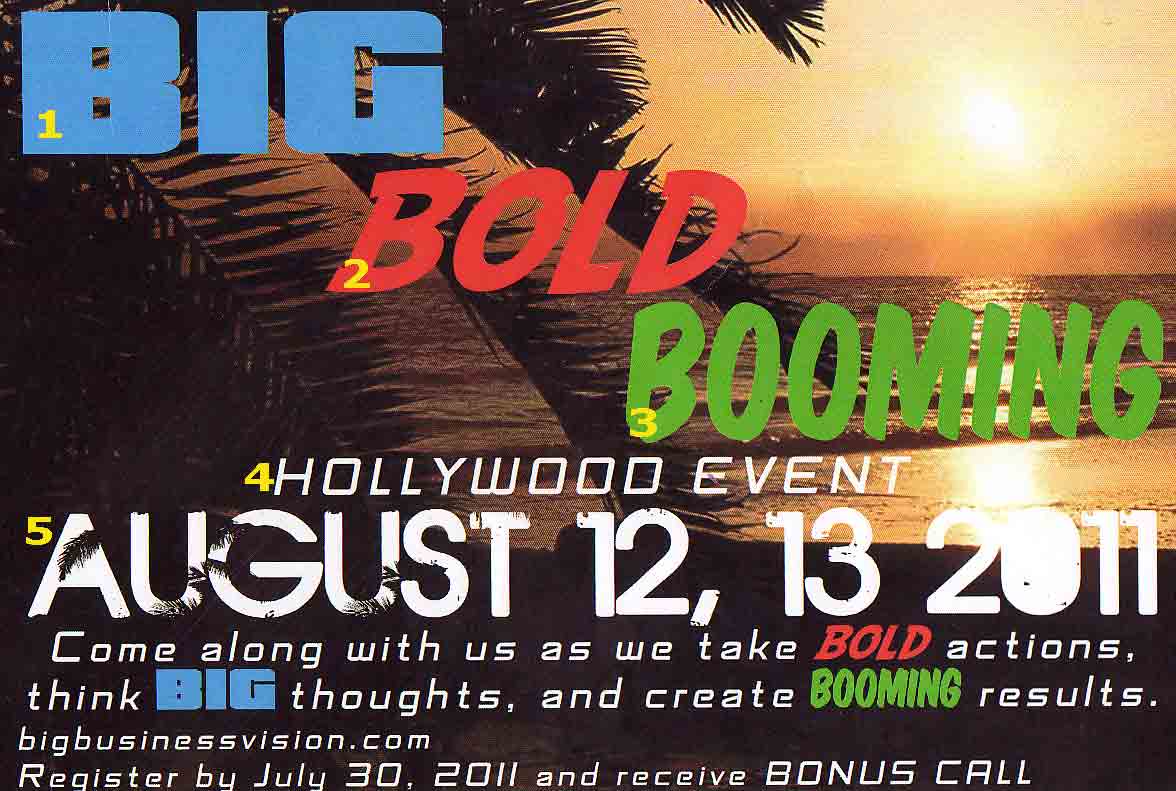
Nothing derails a design faster than a font brawl. Mixing typefaces can add contrast and personality but when they clash, it’s visual chaos. Think of it like inviting too many loud guests to the same dinner party: nobody’s listening, and everyone’s shouting for attention.
Pairing an elegant serif with a quirky display font can work beautifully if there’s balance, but throw in a bold script and a condensed sans, and you’ve got confusion instead of cohesion. The key is harmony, fonts should complement each other’s tone and rhythm, not compete for the spotlight.
Designer Insight
Stick to 2–3 typefaces max, any more than that and your layout starts to look like a typeface talent show gone wrong. For more on typography check out the Flux Academy guide on typography.
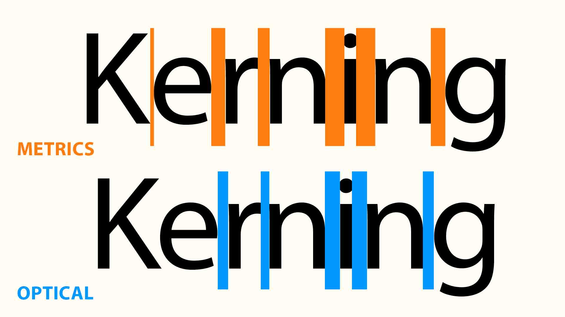
Kerning and tracking might sound like tiny details, but they can make even the best font look like it failed design school. When text is jammed together, it’s like someone whispering too close, uncomfortable and impossible to ignore.
Spread it too far, and the words lose connection, like a band trying to play together over bad Wi-Fi. The sweet spot is invisible when you don’t notice the spacing, that’s when the designer nailed it.
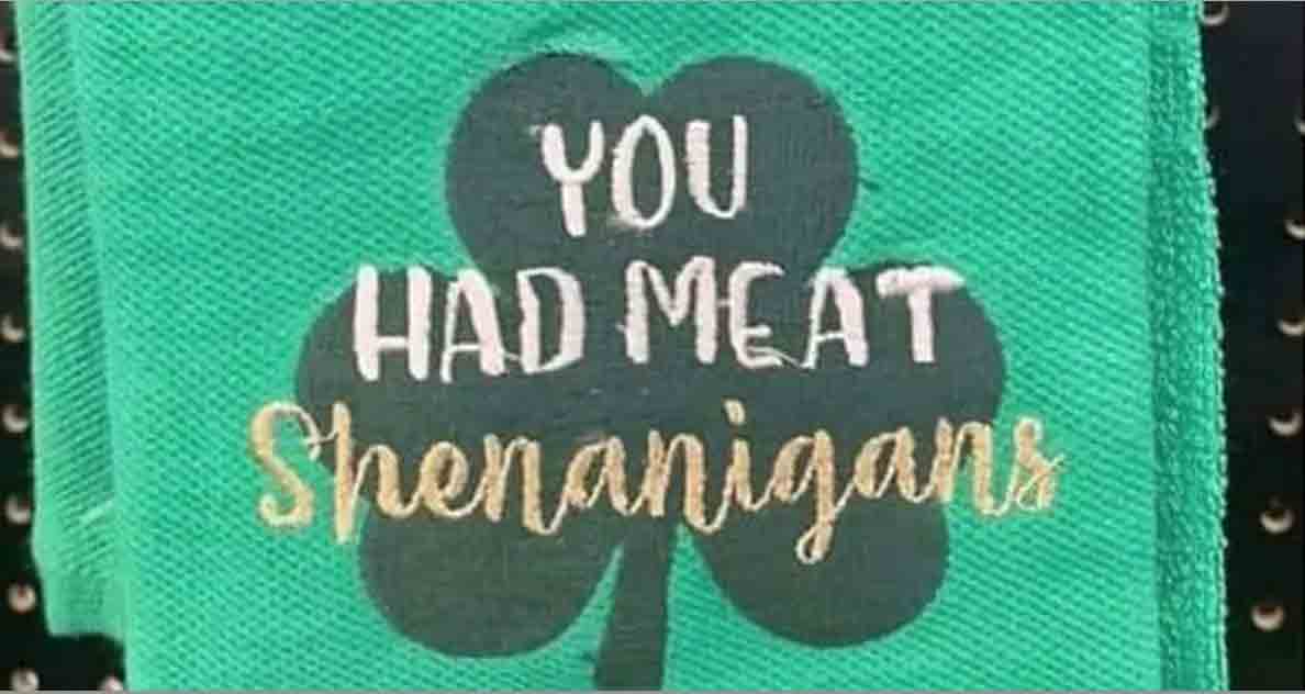
Bad kerning can cause all kinds of shenanigans and not the fun kind. Kerning is the subtle art of adjusting the space between letters so words feel cohesive and balanced. When it’s done right, you never notice it; the text just feels right, quietly guiding the eye along a smooth visual rhythm.
When the kerning is off, it’s impossible to ignore. Uneven spacing can make words feel jumpy, disjointed, or even take on a whole new meaning altogether sometimes an unintentionally hilarious or mortifying one.
Designer Insight
Kerning isn’t about perfection, it’s about the actual perception. For example, the pair “AV” naturally creates a weird gap because of their angled shapes. A good designer tucks them closer so the negative space feels even with the rest of the word.
Fancy script fonts can add personality, but if your audience has to squint, you’ve lost them. Function always trumps flair. The moment your text turns into a guessing game, it stops communicating and starts performing badly.
Overly decorative typefaces often look elegant at first glance, but zoom out or shrink them down, and suddenly your “Welcome” looks like “Weleorn” and your “Sale” looks like “Safe.” If people can’t read it instantly, they’ll scroll, walk, or click away.
Good design balances beauty and clarity. You can still use expressive type—just pair it with legible supporting fonts, use it sparingly for headlines or accents, and always test it in real-world sizes. Remember: if you have to explain what it says, it’s not design—it’s a puzzle.
Designer Insight
Good typography doesn’t just look good, it works wherever you put it. If your audience stops reading because they’re admiring (or deciphering) your font choice, you’ve lost them.
Typography is the voice of your design, it speaks before your words do. Choose wisely, space generously, and keep readability front and center. A beautifully designed layout means nothing if people can’t actually read the text.
Every font, space, and letter shape carries personality. Whether it’s bold and confident, quiet and refined, or loud and unhinged, your typography tells the story before your content even starts. The best designers know that restraint is power — because legibility is what turns design from decoration into communication.
So don’t let bad kerning, over-stylized fonts, or typography chaos steal the show. Let your message sing clearly in key, on tempo, and with just the right amount of space between the notes.
Browse more TYPOgraphy articles to see fonts behaving badly, and how small adjustments can turn design chaos into clarity.
Your weekly dose of sarcasm and insight delivered straight to your inbox