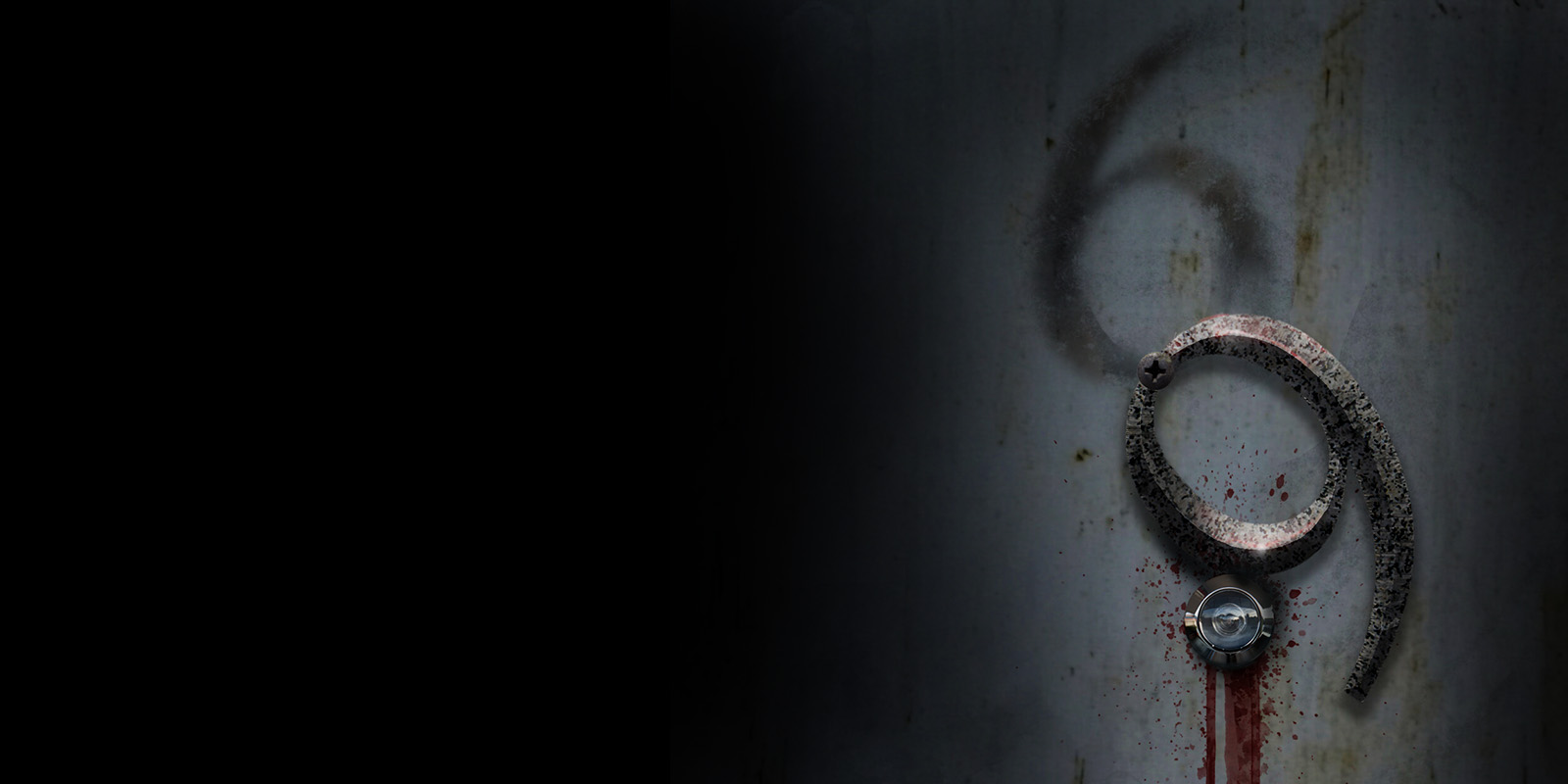
K.I.S.S. Keep it Simply Scary
How an ordinary typeface can become something truly terrifying
When we think of horror typography, we usually picture the typical dripping letters, jagged or scratchy edges or Gothic typefaces. But some of the most unsettling typography doesn’t start with a “scary” font. A perfectly ordinary typeface can become terrifying when you change its context, texture, lighting and design.
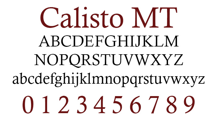
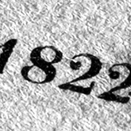
For this project, I started with a single number in Calisto MT, a
traditional serif typeface.
On its own, there’s nothing scary about it. It’s clean,
dependable, readable and often used in print and editorial design.
The process, step by step
-
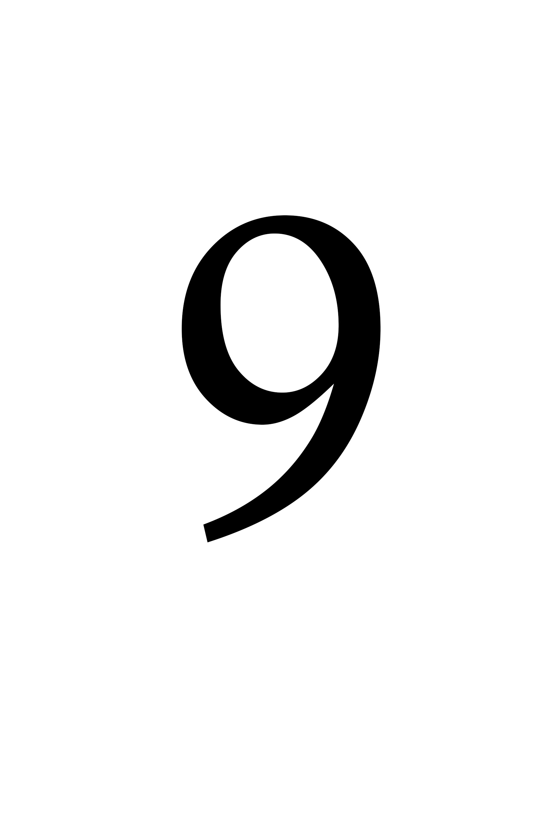
1. Start with a character
-
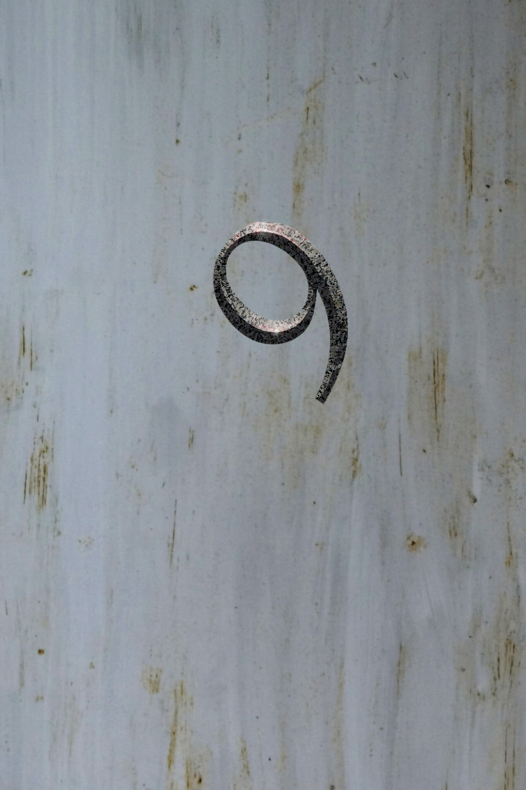
2. Add some texture
-
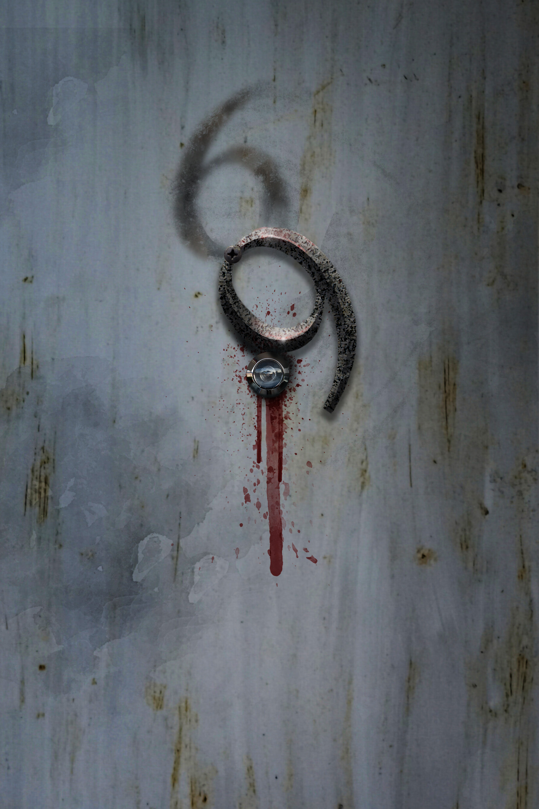
3. Add background and details
-
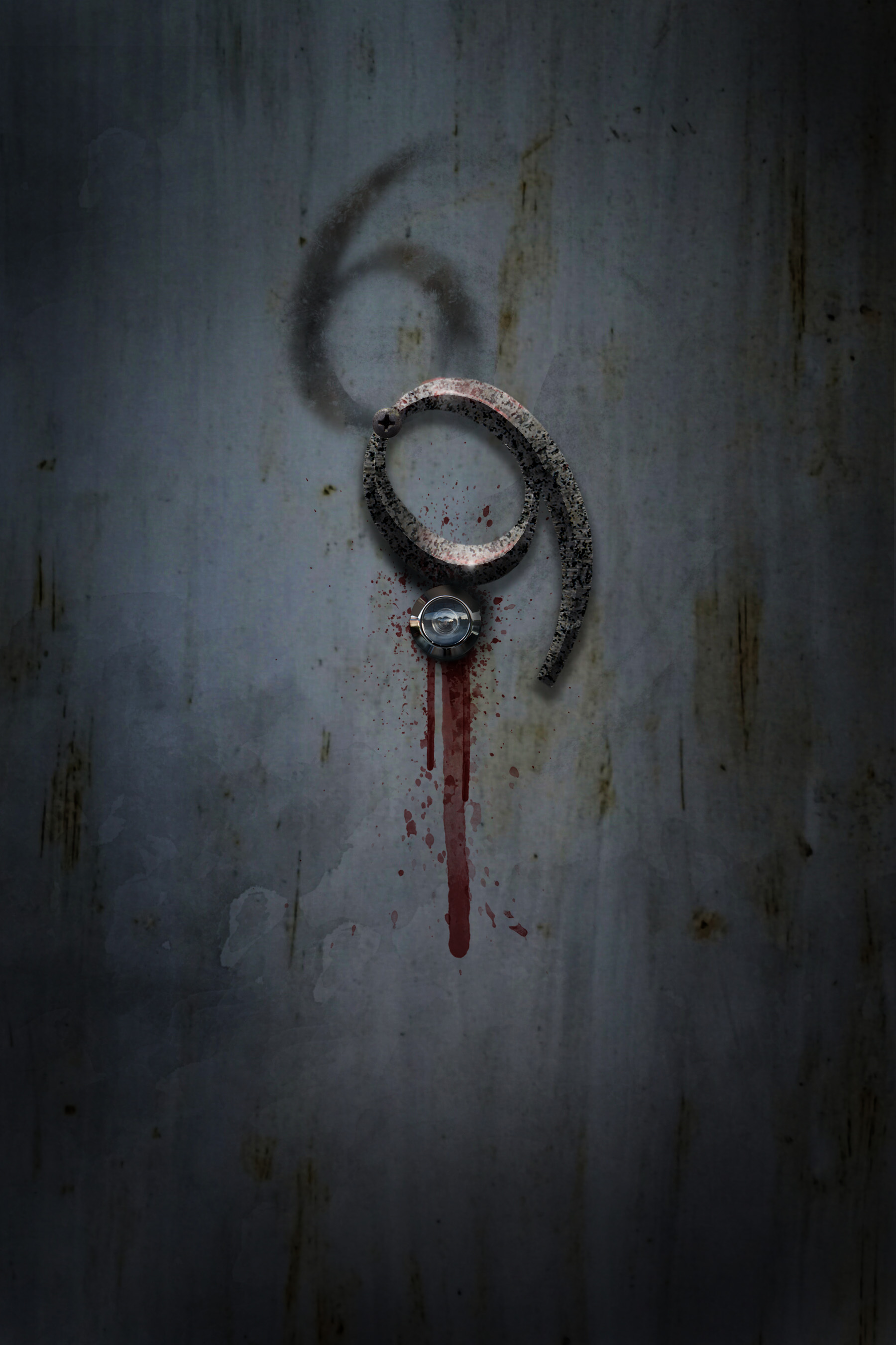
4. Add lighting and effects
What Actually Makes it Scary
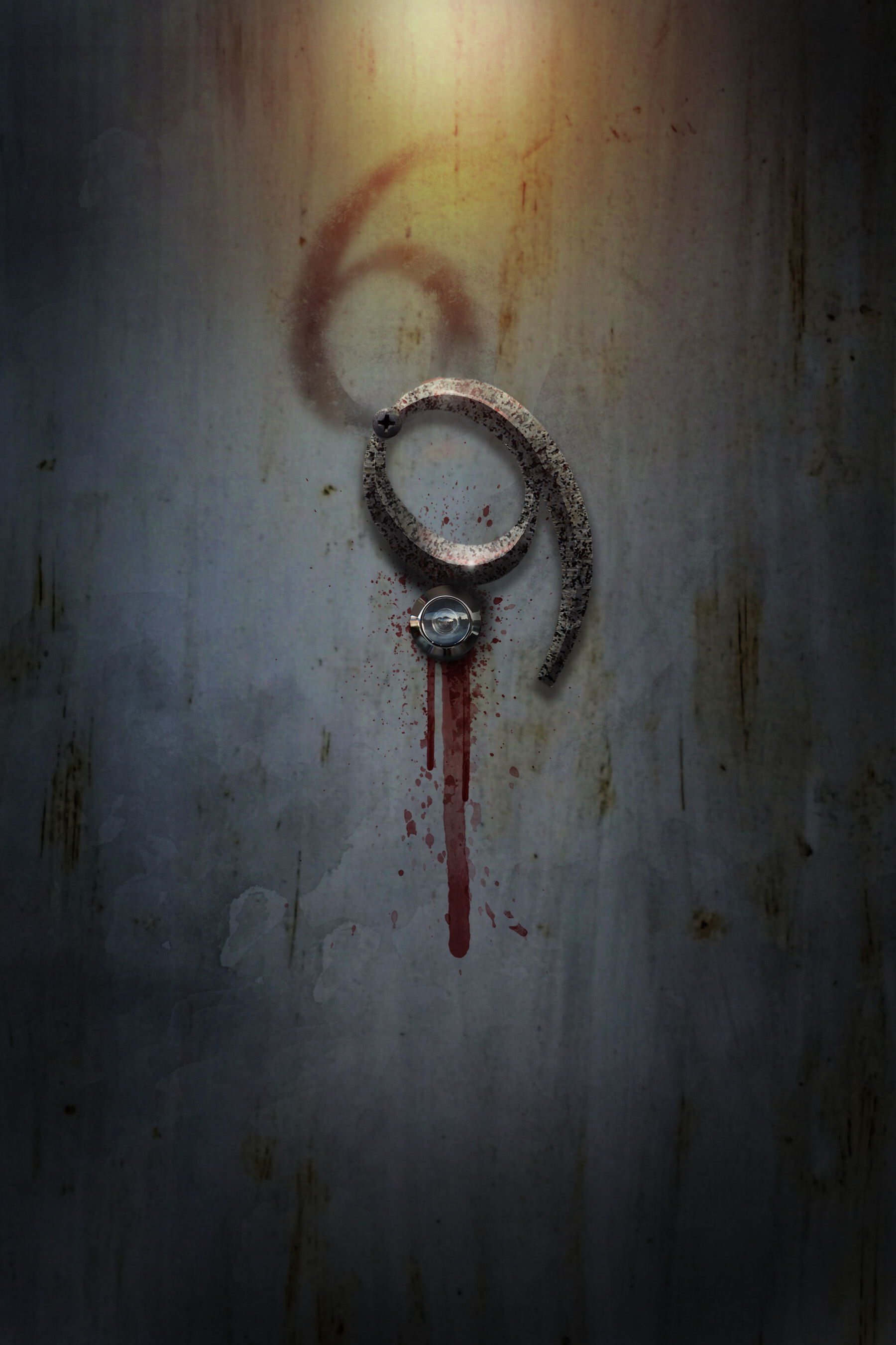
The number itself didn’t change much – the horror comes from how it is edited into the design. Here are the key elements that turn a simple character into something unsettling:
- Context: a door, a location, a story
- Lighting and shadow: creates mood and depth
- Texture: age, decay and imperfection
- Color: muted tones with a hint of blood
- Scale and negative space: makes it feel isolated
- Distortion: subtle changes can feel uneasy
- Suggestion: letting the viewer imagine what’s behind the door

Try the K.I.S.S. Challenge
Pick the most ordinary typeface on your computer and make one letter or number frightening – without relying on horror fonts. Experiment with scale, lighting, texture and context. You might be surprised how little effort it takes to create something truly terrifying.
Challenge Accepted!