8 Modern Movies You (Probably) Didn’t Know Use Digital Color Grading
Come with us as we dive into the dazzling world of hues, shades, and the occasional neon explosion! Digital color grading has become a vital tool in modern cinema, allowing filmmakers to adjust colors in post-production to create moods, highlight themes and shape how we experience their stories. Let’s explore eight films that you (probably) didn’t know were sprinkled with the magic of digital color grading!
1. Mad Max: Fury Road (2015)

The blazing oranges of the desert clash with the cool blues of the night. The colors don’t just pop—they symbolize the chaos of the world Max navigates. Try not to get lost in the colors while your heart races!
2. The Grand Budapest Hotel (2014)
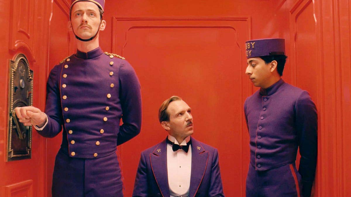
Wes Anderson is already known for his quirky, symmetrical aesthetics, but his color grading takes it to another level. Anderson’s use of pastels creates a nostalgic, storybook-like feel. The soft pinks, purples, and yellows evoke a fading era, making the color grading essential to the film’s whimsical tone.
3. Blade Runner 2049 (2017)
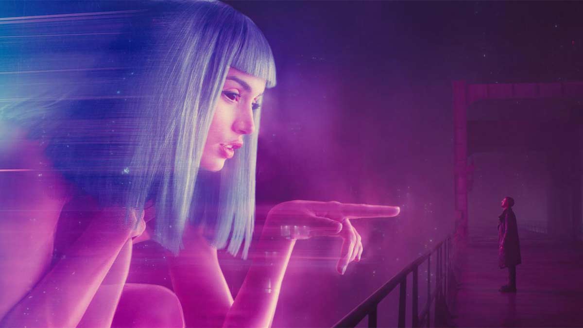
If you thought the original Blade Runner was a visual treat, just wait until you feast your eyes on the sequel! Cold, de-saturated tones in the city contrast with the warm hues of the desert. Neon blues and reds reinforce the artificial world of replicants, while muted earth tones suggest decay in the human landscape. Who knew dystopia could look this good?
4. The Matrix Resurrections (2021)
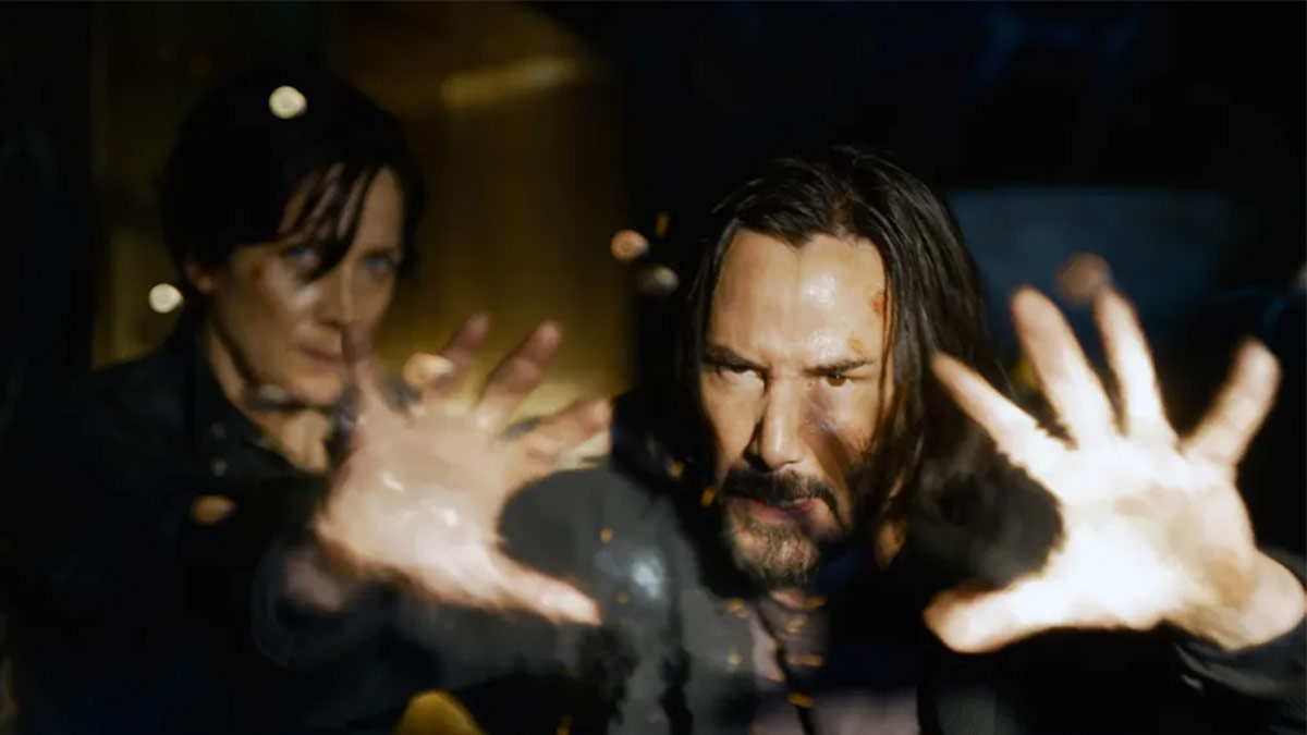
The Matrix series has always played with color (hello, green tint!), but the latest installment pushes it further into the digital realm. Gone are the green tints of the original trilogy—The Matrix Resurrections uses subtle blues and reds to differentiate reality from illusion.
5. Her (2013)
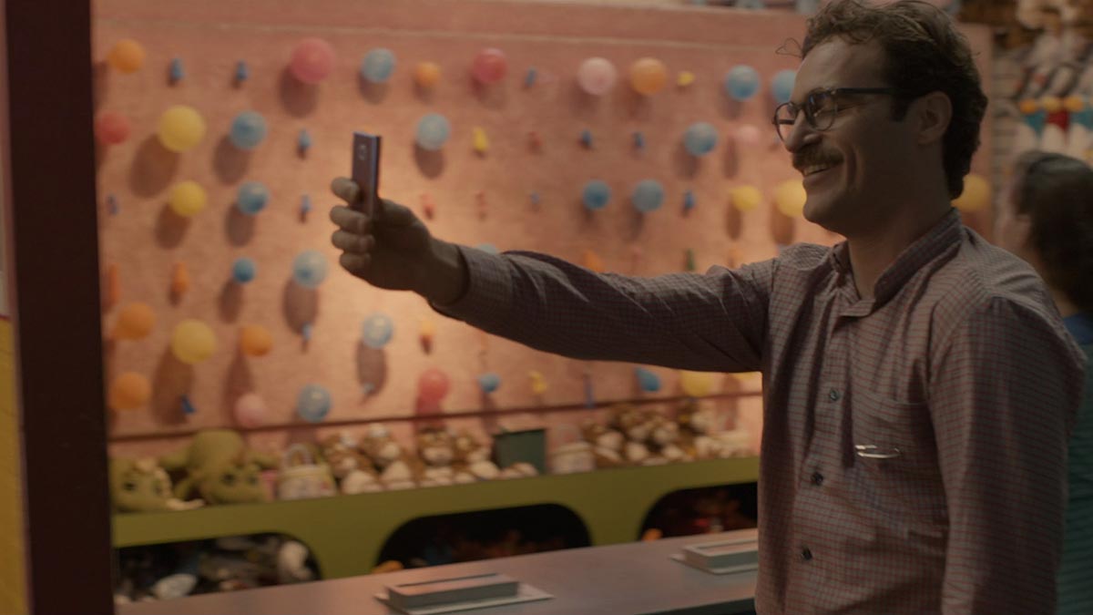
Spike Jonze's Her isn’t just a film about falling in love with your operating system. The soft color palette adds layers to the story, making every moment feel intimate. The reds and yellows deepen the emotional resonance of the story, making us feel the intimacy of a man’s connection with an AI.
6. Birdman (2014)
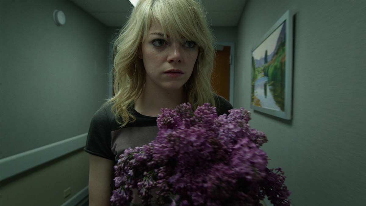
Shot to look like a single continuous take, Birdman utilizes color grading to enhance the film's surreal quality. The colors shift seamlessly, mirroring the protagonist’s descent into madness. As the protagonist unravels, the colors become cooler and desaturated, mirroring his mental decline.
7. Black Panther (2018)
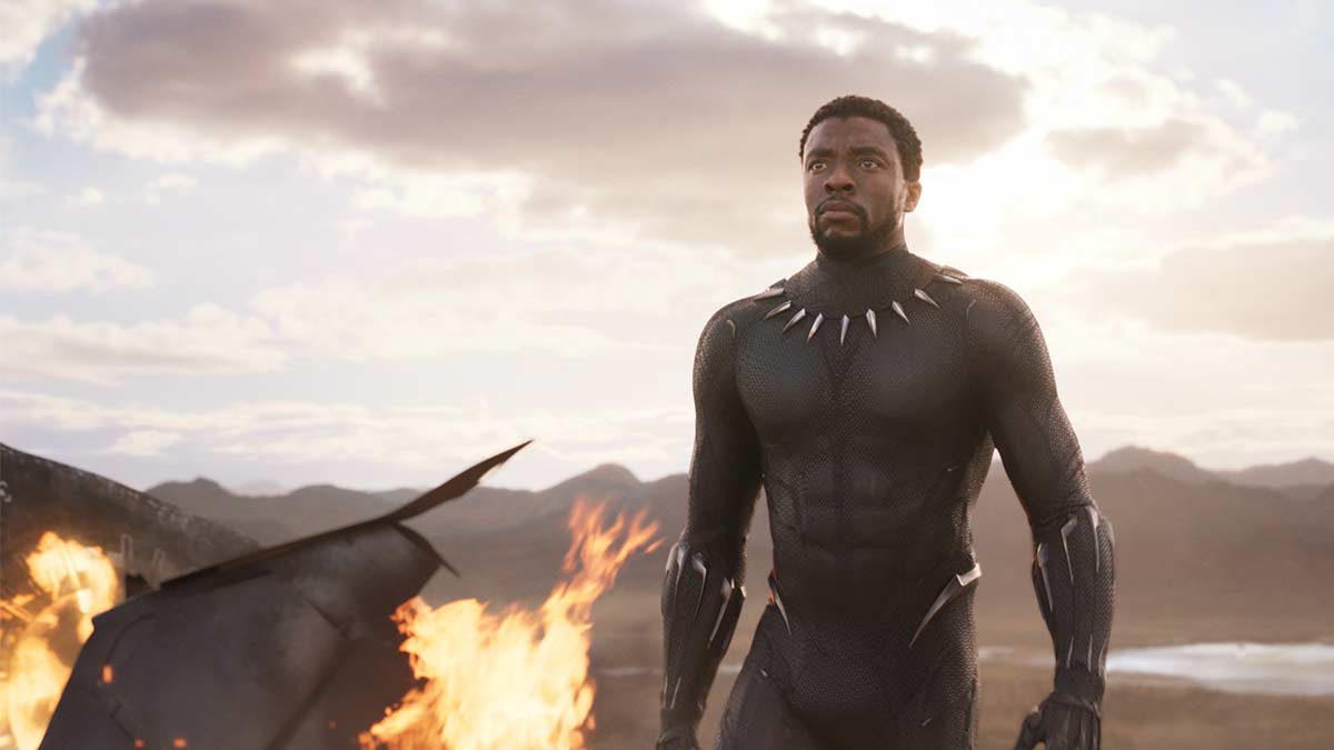
Black Panther isn’t just a superhero film; it’s a vibrant celebration of culture and color! The digital color grading highlights the contrast between tradition and technology. Deep purples and greens symbolize Wakanda’s heritage, while blues and silvers represent its technological advancements. Just try not to get too distracted by how cool everything looks while the story unfolds!
8. The Shape of Water (2017)
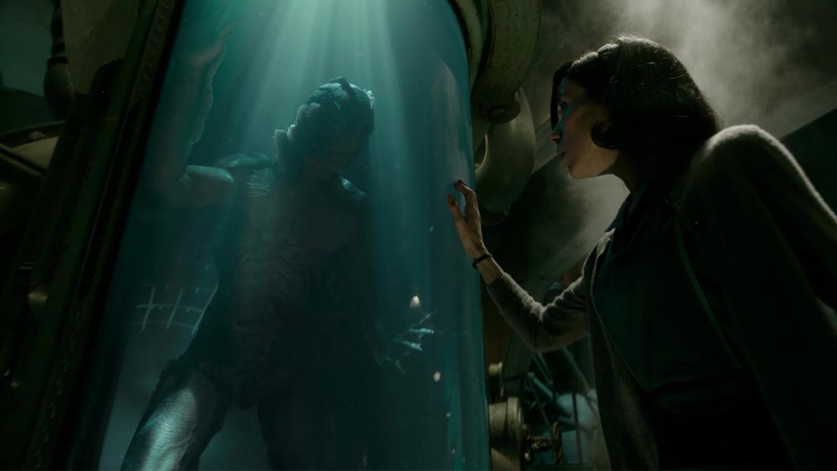
This romantic tale of a woman and her amphibious friend is a feast for the eyes, thanks to its dreamy color palette. The green and blue tones in The Shape of Water create a fluid, aquatic feel, reflecting the underwater love story. Contrasting warm highlights during intimate moments symbolize emotional warmth between the characters.
So, there you have it! Eight modern films where digital color grading plays a crucial role in creating those unforgettable visuals. From the fiery landscapes of Mad Max to the pastel dreamscape of The Grand Budapest Hotel, digital color grading is more than an aesthetic tool—it shapes the emotional core of each story. The next time you watch these films, keep an eye on the colors—they’re doing more than you think!
Want More Insights Like This?
If you enjoyed this deep dive into the world of film visuals, sign up for our newsletter below! Get the latest movie analysis, expert tips, and exclusive content delivered right to your inbox. Don’t miss out—subscribe today!
Subscribe Now
Get the latest cinema industry insights straight to your inbox