Content Hierarchy: Four Quick Ways to Make Standout Text
So, you’ve got yourself a nice document—a poster, an invitation, maybe a resume or story. You’ve picked a nice font or two. And now, to make sure it stands out, time to make EVERYTHING BOLD AND/OR CAPS LOCK!!!
Please don’t do this.

If you only have one takeaway from this article, let it be this:
If everything is emphasized, nothing is.
A single car alarm goes off in the middle of the night; the neighborhood wakes up. Car horns rage in the middle of traffic; no one stands out. The same principle applies to text.
Consider the image above. To the left, the entire paragraph is bold; what’s supposed to strike you first, if anything? But to the right, simply putting a sentence on its own line catches the eye.

There are multiple ways to emphasize text; you don’t have to use them all.
In fact, bearing the point above in mind, you probably shouldn’t. Consistency is key. Notice how the article titles throughout this site*, for example, are bold, large, and a sans-serif; at no point is one suddenly blue or all caps. (*Does not apply to WordPress.)
A quick rundown of ways to emphasize text are as follows:

Size
Bigger is better? Not necessarily. Balance is better. Titles can probably afford to stand out from a distance, but exercise caution with subheadings. Consider the typographic scale; you don’t have to follow a ratio, but the defaults exist for a reason.

Bold and italics
Use one. Not both. Generally speaking, bold stands out more, while italics are meant for emphasis within a larger block of text. Also keep in mind this note about italics, from Matthew Butterick’s Practical Typography:
If you’re using a sans serif font, skip italic and use bold for emphasis. It’s not usually worth italicizing sans serif fonts—unlike serif fonts, which look quite different when italicized, most sans serif italic fonts just have a gentle slant that doesn’t stand out on the page.

Color
This warrants an article of its own, but in short: use with caution. Make sure it stands out from the background. For the most part, you can’t really go wrong with black on white. (It may be too stark on the web, however.)

A note on capitals
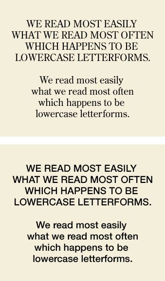
An early internet rule you may have learned is “All caps reads like screaming.” The intro to this article gave you a taste of it.
All-caps for very short headers can work. Capitals for a full line or more is pushing it.
Having said all that, the emphasis that works best will vary by document. Bold alone might suffice; multilevel headings may warrant more. And as noted previously, switching up the font of heading text is also a good start. Play with it, see what you like.
But as a rule of thumb, less is more.