Typographic Sins (and How to Fix Them)
Johan G. has a problem. The local Registry of Editing And Documentation group is holding a meeting later this week, and he’s been tasked with making a one-page infographic to advertise it.
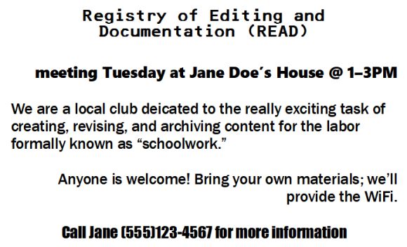
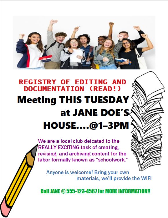
He’s been handed the page above as an example of last week’s meeting handout. And, being someone who cares about readability, he’s going to redo it from the ground up.

DON’T distort. DO resize proportionally.
The first thing you probably noticed on the R.E.A.D. example is the image distortion. People, even awkward stock photo people, don’t look so squished.
Fortunately, the fix is simple: in most editors, simply pressing and holding Shift while resizing will maintain the original proportions. If this doesn’t do the trick, a simple search for “resizing in [your program here]” should yield results.
Similarly, don’t stretch text. Thankfully, resizing this in many a text editor is simple as changing the font size. In less-text-based programs like Photoshop, the technique above applies.

DON’T emphasize everything. DO determine structure (and emphasize accordingly).
This was already mentioned in the hierarchy article, which also discusses methods of emphasizing text, but bears repeating: If everything is emphasized, nothing is.
The most important content of the R.E.A.D. handout can be broken down as follows:
- header image
- group name
- what they do
- where and when the meeting is held
- contact information
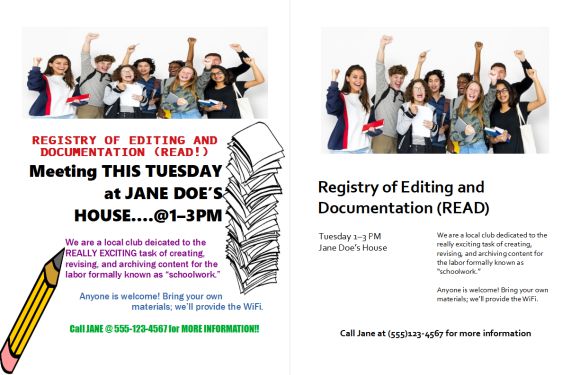
Clipart is also present. It is likely breaking a few copyright laws, used in fifty other five-minute posters, and generally unnecessary. If you need to use clipart, it may be because your document isn’t standing out enough as-is (or, in this case, is trying too hard to stand out and loses focus in the process).
If you can avoid it, don’t use clipart.
Otherwise, vital information is present. Since this handout doubles as a poster (will be pinned at the office) and a handout (copies will be stacked at the front desk), Johan decides the most important information is as follows:
- header image (which, by the way, should be of the actual group)
- group name
- where and when the meeting is held
- contact information
- what they do

Now we're getting somewhere!
DON’T align text haphazardly. DO pick a layout and stick with it.
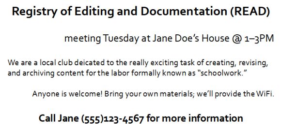
You might have noticed centering text was absent in the hierarchy section. English reads left to right; it’s easier to tell where lines begin when they all line up. Centered or even right-aligned text isn’t a sin, but use with caution.
Once again, consistency is key. You don’t have to use a preset template (though if you’re at a total loss, they exist for a reason), just don’t be haphazard. A grid may be your friend.
In the R.E.A.D. flyer, the section on “what they do” is a few sentences long. There was no need to have it go back and forth on the page. As you can see above, grouping the text together and placing it consistently made a huge difference.
Don’t be afraid of boring.
Somewhere during this process you may have doubts. Now everything is black and the same font. Sure, you may be familiar with the crusade against Comic Sans and other novelty fonts, but you know better than to use Arial or Times New Roman. How else are you supposed to make your words stand out? And without fun little pictures from the internet, won’t peoples’ eyes glaze over when they look at your document?
However: there’s no use injecting personality into your presentation if no one can take it seriously, if they can understand it at all. Readability rules. Default boring essay formats suck; layouts that no one can navigate suck more.
If you’re picking the right typefaces and organizing your content well, the result may not be as boring as you expected.

Of course, there’s lots of gray area between some Platonic typographical ideal and an exaggerated sample like Johan’s original R.E.A.D. poster. Alas, the trouble with one-size-fits-all advice is that what works for one document might not work for the next; rules are made to be broken and different contexts have different needs.
Granted, the issues covered in this article are still things you’d want to avoid. But tips for what to do won’t be the one-stop shop for everything.
This website barely scratches the surface of typography. There are several fantastic links throughout these articles and on the resources page, where a majority of research for this site was done; give them a browse if you’d like to learn more.
But whether or not your typographic reading stops here, thanks for stopping by. You now know that a little more than the average person about presenting written content well! Congratulations!
