Bold typography for the regular person.

Bite-size, accessible articles break down the basics of type for anyone to learn—no design background necessary.

Start here

Latest articles

article one head

Typographic Sins (and How to Fix Them)

by Some Person October 16, 2018

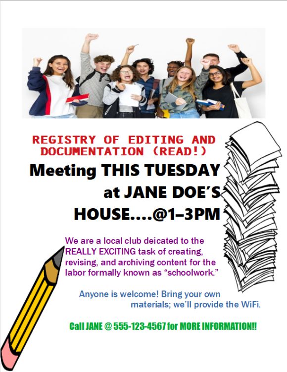
Johan G. has a problem. The local Registry of Editing And Documentation group is holding a meeting later this week, and he’s been tasked with making a one-page infographic to advertise it.

He’s been handed the page above as an example of last week’s meeting handout. And, being someone who cares about readability, he’s going to redo it from the ground up. Read more ▶
Content Hierarchy: Four Quick Ways to Make Standout Text

by Some Person October 14, 2018

So, you’ve got yourself a nice document—a poster, an invitation, maybe a resume or story. You’ve picked a nice font or two. And now, to make sure it stands out, time to make EVERYTHING BOLD AND/OR CAPS LOCK!!!

Please don’t do this. Read more ▶

article three head

Choosing Type (part 2 of 2): Font Matching

by TLT November 2018

In part 1, we covered what typefaces are and four broad categories they can belong to. And now for the fun part: playing matchmaker with type.

On one hand, there are no universal rules here. Sometimes opposites attract; sometimes fonts of a feather work together. But you don’t have to throw darts at your system fonts and pray for the best. Here are some guidelines to get you started. Read more ▶