What is Typography and Why Does it Matter?
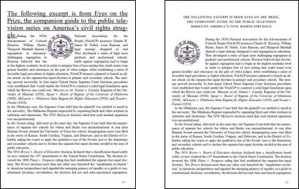
Which of these stories would you rather read?
We may be taught not to judge books by their covers, but we can’t help it. Chances are, the poster on the right looks easier to read, even though on closer inspection the text is the same.
This is typography.

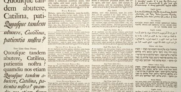
Typography is how words look.
Merriam-Webster has two definitions for “typography”:
1: letterpress printing
2: the style, arrangement, or appearance of typeset matter
The first definition may bring the printing press to mind, but in an age where anyone can open a document program and get typing, the arrangement of text doesn’t just apply to manuscripts. Where there are words, there is typography.

Improved typography = improved reading = improved communication
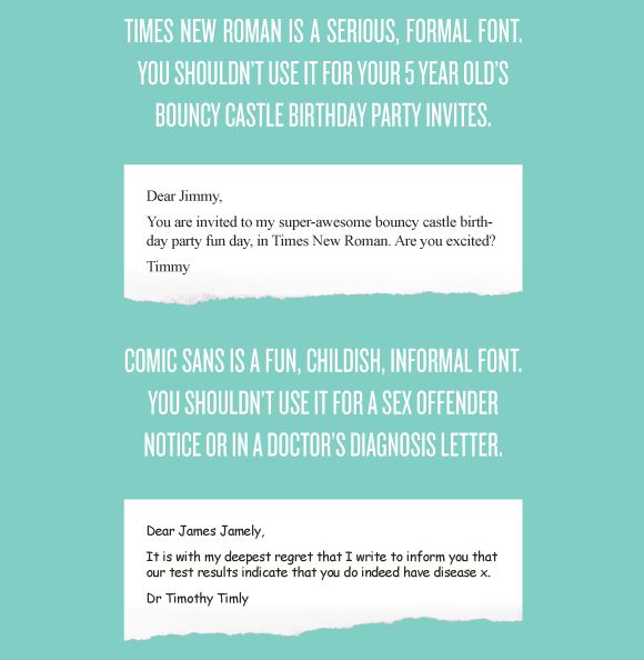
Not all words are created equal. You wouldn’t write a business letter with the same tone you’d use speaking to children or vice versa. Likewise, font choice can make you look like a professional—or a hack.
Typography exists to serve content. Sure, you could put something together in Times New Roman and use CAPS FOR EMPHASIS. But with rare exceptions*, you don’t have to.
*Students may bemoan “12pt double-spaced Times New Roman” requirements. This article is not suggesting you disregard any formatting restrictions given. But if you have the option, why not make it look nice?

Good typography enhances your message. Bad typography detracts.
In 2007, Microsoft reading researcher Kevin Larson and MIT professor Rosalind Picard published a study examining the effects of typography on readers. They found that “good typography induces a good mood,” as proven by performance on a creative task:
We found that 4 of 10 participants successfully correctly solved the task in the good typography condition while 0 of 9 participants correctly solved the task in the poor typography condition.
If differing performance rates on a cognitive challenge aren’t convincing, consider the following: According to the Journal of the American Medicine Association, even when physicians use computerized systems, patients can receive the wrong medication.
Sure, people make mistakes, but the blame can’t fall entirely upon human error:
Different CPOE computer screens offer differing colors and typefaces for the same information, enhancing misinterpretation as physicians switch among screens. Patients’ names are grouped alphabetically rather than by house staff teams or rooms. Thus, similar names (combined with small fonts, hectic workstations, and interruptions) are easily confused.
A system depended on for the health of countless people is plagued by bad design, notably including a small font. Typography could help.

Typography impacts everyone.
You might not be in charge of a complex medical system that affects thousands. But if you’ve ever read a stop sign or made a handout, congratulations, you’re familiar with typography!
Typography isn’t just the realm of professional designers. You don’t need a degree or fancy program to use it well, even if your knowledge of page structure begins and ends at the Microsoft Word toolbar.
Or you can keep making fliers at default sizes in default fonts with default layouts, no matter what you’re trying to convey. Your call.
