Choosing Typefaces (part 1 of 2): Types of Type
Open a program with text editing, any program, and chances are you’ll see more typefaces than you know what to do with. If you don’t want to stick with the defaults, picking the right type for the job can be daunting.
But before you start searching for the perfect pair, it’s important to understand what you’re looking at.
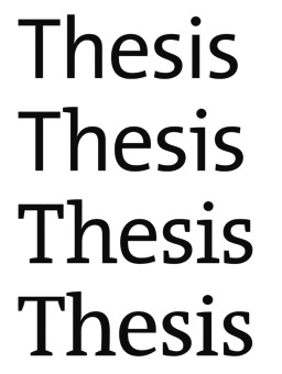
Type family. Font. Sans-serif. Blackletter. Oblique. Monospace. Where do you start?
First, a clarification on terminology: a typeface is a certain design for letters and other symbols, whereas a font is a particular way that type can look. For example, Calibri is a typeface, and Calibri Italic is a font. Nowadays, the terms are technically interchangeable.
In the interest of being pedantic, we’ll mostly be using typeface here.
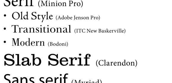
But in the interest of being brief, we’re also not going to cover every single type variation. Instead, there are four major categories you’re most likely to encounter:
Serif & Sans-Serif
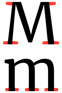
The font you’re reading right now is Merriweather Regular, a serif typeface. The decorations at the end of lines in most letters, highlighted in the image above, are serifs. Typefaces without these lines are sans-serif, literally “without serif.” (Headers on this website are set in Merriweather Sans.)
There has been some debate over which style is more legible, both onscreen and in print, but myths abound. For example, although sans serifs are usually associated with a modern, casual tone…
The use of a sans serif typeface alone does not convey a message of informality. It can be informal when used with other imagery or in conjunction with a novelty typeface.
But one of the nice features of a sans serif typeface – and one of the things that makes it a flexible choice – is that it tends to take on the characteristics of surrounding typefaces. So a sans serif paired with an old style font will have an aged and classic feel; a pairing with an ornate script may feel more formal or feminine.
Does this mean you should use sans-serifs for every project? Certainly not. But keep in mind that its inherent lack of decoration could make it a more “neutral” choice than a serif, and experiment accordingly.
Display
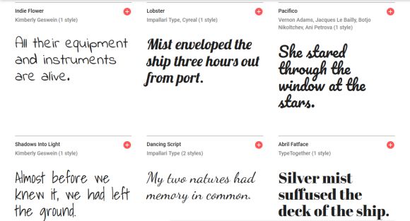
Display typefaces range from Ye Olde Blackletter to cursive-looking scripts to everything in between and beyond. Their one similarity: intended for use at large sizes, such as headers and signs.
Whereas serifs and sans-serifs are usually safe bets for body text (the main content), display typefaces are too decorative to work well at smaller sizes. Consider the following:
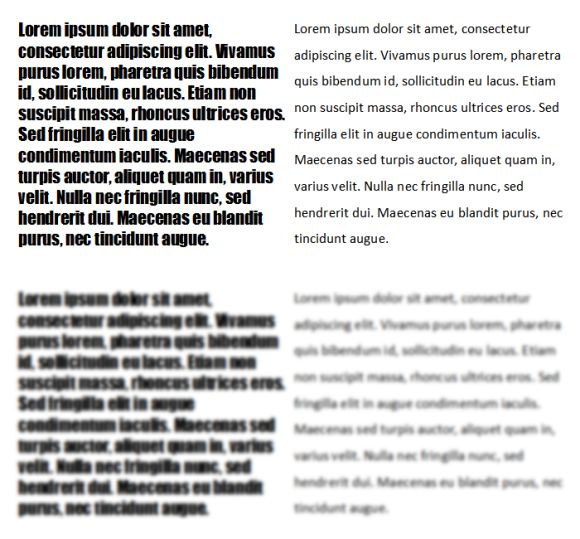
On the left is Impact, and right is Calibri. Although Impact stands out more, it’s not necessarily for the better; you’re likely to have more trouble distinguishing the letterforms than in Calibri. And when the text is blurred, the difference in both weight and letter variation becomes clearer.
Readability is key. Much like you wouldn’t want to decorate a wall so much it covers the windows, you wouldn’t want to set a paragraph in a display typeface unless you want to make it harder to read. Which isn’t to say display typefaces don’t have a place, but use them with discretion. After all, typography exists to serve content.

Monospace
As the name implies, characters in monospace typefaces have the same width. This is useful in, for example, coding, where being able to spot stray semicolons or extra spaces is vital to ensuring everything runs as it should. Typewriters also use monospace fonts like Courier.
It should be noted that monospace typefaces are not their own category in the way that serifs, sans-serifs, and display typefaces are. Instead of being defined by decoration, you can recognize a monospace font by letter width. Courier, for example, is a monospace serif, while Lucida Console is monospace sans-serif. Typefaces in which letters have different widths have the surprising categorization of variable width.
So why make a section just for monospace? If it’s so utilitarian, why consider it at all? Because, and exactly for that reason, it demonstrates something worth keeping in mind no matter which fonts you’re considering:
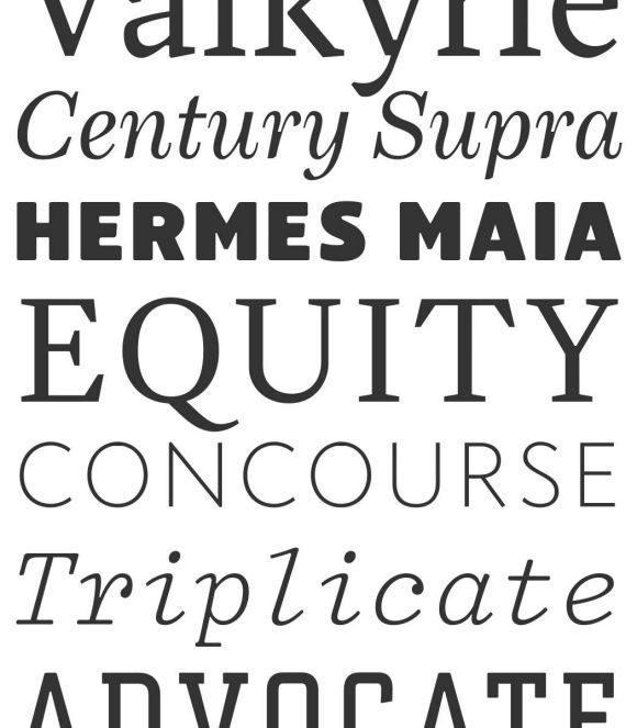
All fonts are not created equal.
Making a complete, quality typeface is not easy. Countless factors go into the design of each letterform and the spaces between, far beyond whether they have serifs or not. Consequently, typefaces are created with purpose.
While this doesn’t mean you need to commission a new typeface every time you have a different project, it does mean it’d serve you well to consider the intended purpose of typefaces you’re interested in.
