Choosing Typefaces (part 2 of 2): Font Matching
In part 1, we covered what typefaces are and four broad categories they can belong to. And now for the fun part: playing matchmaker with type.
On one hand, there are no universal rules here. Sometimes opposites attract; sometimes fonts of a feather work together. But you don’t have to throw darts at your system fonts and pray for the best. Here are some guidelines to get you started.
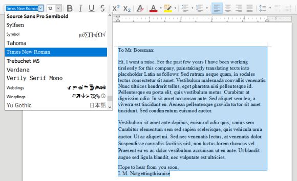
Consider a base font.
You’re not going to have much luck with pairings if you haven’t decided on a single font yet. Do you want a friendly, open sans-serif? an authoritative, professional serif? Look for something that works for a majority of your text.
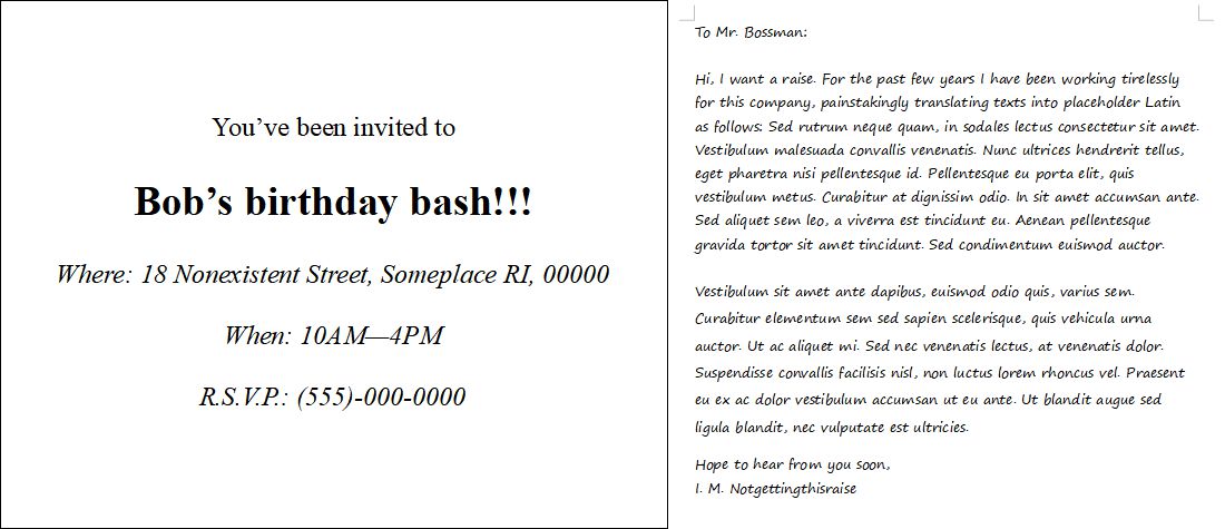
Sometimes it’s easier to tell what fonts don’t work than fonts that do. If in doubt, the process of elimination is your friend. And please reconsider any defaults:
When Times New Roman appears in a book, document, or advertisement, it connotes apathy. It says, “I submitted to the font of least resistance.” Times New Roman is not a font choice so much as the absence of a font choice, like the blackness of deep space is not a color. To look at Times New Roman is to gaze into the void.
To contrast or not to contrast
Great, you have a body typeface! Time to pick all those other nice-looking fonts you skimmed over before settling on this one, right?
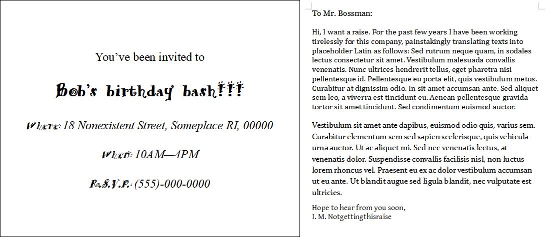
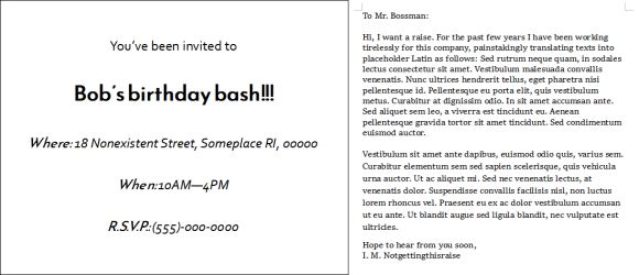
Not quite. In the invitation example above, a single new typeface has been added: AR Hermann, a (terrible) display font It’s big, obvious, and stands out—maybe too much. Notice that the legibility of smaller text is suffering.
The work letter, however, uses no less than 4 typefaces, all serifs, and with just enough difference to look wrong. It looks disjointed. But would gaudy display type be appropriate here?
As a rule of thumb, if you’re using different typefaces (and you don’t always have to!), make sure they’re visually distinct but convey the same mood.
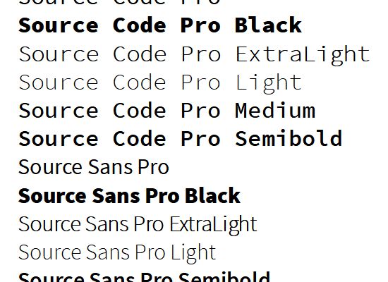
My brother sans: matching from the source
As the font is to a typeface, the typeface can be to a type family. Fonts, as a refresher, are specific ways a typeface can be styled. Most typefaces stand alone and send you into the depths of font lists to find a match. But sometimes designers make your job easy and design interrelated typefaces, known as type families.
Matching typefaces from the same family is a safe bet. The most basic type family is a serif and a sans-serif, but you can also find families with variations like display and monospace. And you can usually tell they were made to match from their creative naming convention:

Pairing types from the same designer(s) can also work, even if they’re not obviously related. Run a Google search for your choice typeface(s) and see if the designer has other options. Like an author who writes for different genres, each typeface might be designed for its own unique purpose, but the creator’s design style likely runs through each.
If your type of choice doesn’t have any obvious relatives, return to mood, and see what works (or not). Experiment. What looks nice as a sample line or two might not work for your full document.
The usual advice is a serif for body text, a sans-serif for headings (or vice versa), and maybe a display or two for titles. Again, no rule is foolproof, but notice how it’s not recommending more than two or three typefaces, no matter how expansive your text.
No matter what typefaces you choose, don’t use too many. Different fonts of a single type might be fine. Two is acceptable. Three is pushing it.
If you’re trying to emphasize everything, you’re emphasizing nothing.
